1. Windows Store apps made easy with Prism and Prism project templates
2. Views, ViewModels and navigation
3. Configuring Prism using Unity or Ninject
4. Displaying About, Settings and other Flyouts
Windows Store apps use Flyouts for Login and Settings forms, About dialogs and for displaying other temporary information. While HTML5/JS developers experience the comfort of using native WinJS.UI.Flyout control, XAML developers have to use third-party controls.
Prism for Windows Store provides infrastructure for displaying and managing Flyout dialogs in a simple way.
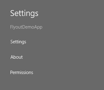
Register Settings Charm commands
According to the Windows Store design guidance, it is recommended to use Settings Charm for providing access to apps’ setting and About dialog. Apps have to register commands by providing titles and command handlers (a function that will be invoked when command is clicked).
Create a new project using Prism Unity app template and open App.xaml.cs. App’s base class – MvvmAppBase – defines virtual method GetSettingsCharmActionItems and we are going to override it to register About and Settings commands.
sealed partial class App : MvvmAppBase
{
    ...

    protected override IList GetSettingsCharmActionItems()
    {
        return new List
                   {
                       new SettingsCharmActionItem("Settings", SettingsCommandHandler),
                       new SettingsCharmActionItem("About", AboutCommandHandler)
                   };
    }

    private void SettingsCommandHandler()
    {
        // TODO
    }

    private void AboutCommandHandler()
    {
        // TODO
    }
}
Registration is done and if you will start the app, you will see two new commands in Setting Charm.
However, command handlers are still empty and before implementing them, we need to introduce visual elements to show.
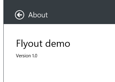
Add About dialog
Use Add New Item dialog and add Flyout View with name AboutFlyout to Views folder. The created view is empty and you can modify it to present any information you need. For example, the following code makes it nicer and displays app’s title and version.
<prism:FlyoutView
    x:Class="FlyoutDemoApp.Views.AboutFlyout"
    xmlns="http://schemas.microsoft.com/winfx/2006/xaml/presentation"
    xmlns:x="http://schemas.microsoft.com/winfx/2006/xaml"
    xmlns:prism="using:Microsoft.Practices.Prism.StoreApps"
    xmlns:d="http://schemas.microsoft.com/expression/blend/2008"
    xmlns:mc="http://schemas.openxmlformats.org/markup-compatibility/2006"
    prism:ViewModelLocator.AutoWireViewModel="True"
    mc:Ignorable="d">

    <Border BorderBrush="{StaticResource FlyoutBorderBrush}"
            BorderThickness="1,0,0,0">
        <Grid Background="{StaticResource FlyoutBackground}">
            <Grid.RowDefinitions>
                <RowDefinition Height="80" />
                <RowDefinition Height="Auto" />
                <RowDefinition Height="*" />
            </Grid.RowDefinitions>

            <Grid Background="{StaticResource FlyoutHeaderBackground}">
                <StackPanel Orientation="Horizontal" Margin="40, 32, 0, 13">
                    <Button Command="{Binding GoBackCommand}"
                            Margin="0,3,0,0"
                            Style="{StaticResource FlyoutBackButtonStyle}" />
                    <TextBlock Margin="10,0,10,0"
                               Style="{StaticResource FlyoutHeaderText}"
                               Text="About" />
                </StackPanel>
            </Grid>

            <TextBlock Text="{Binding AppTitle}" Style="{StaticResource CaptionFlyoutTextStyle}"
                       Grid.Row="1" Margin="40,40,10,10"/>
            <TextBlock Text="{Binding AppVersion}" Style="{StaticResource BasicFlyoutTextStyle}"
                       Grid.Row="2" Margin="40,0,10,10"/>

        </Grid>

    </Border>
</prism:FlyoutView>
Once the Flyout is ready, we need to create corresponding View Model. Note the bindings in the code above: the target View Model needs to provide GoBackCommand command and properties to display title and version.
View Model
Use Flyout View Model template to create AboutFlyoutViewModel class in ViewModes folder. It will generate the View Model with predefined methods for the Flyout lifetime management.
public class AboutFlyoutViewModel : BindableBase, IFlyoutViewModel
{
    private Action _closeFlyout;
    private Action _goBack;

    public Action CloseFlyout
    {
        get { return _closeFlyout; }
        set { SetProperty(ref _closeFlyout, value); }
    }

    public Action GoBack
    {
        get { return _goBack; }
        set { SetProperty(ref _goBack, value); }
    }

    public void Open(object parameter, Action successAction)
    {
    }
}
The following code introduces fields required for the About Flyout.
public class AboutFlyoutViewModel : BindableBase, IFlyoutViewModel
{
    ...

    public ICommand GoBackCommand { get; private set; }

    public AboutFlyoutViewModel()
    {
        GoBackCommand = new DelegateCommand(() => GoBack());
    }

    public string AppTitle
    {
        get { return "Flyout Demo"; }
    }

    public string AppVersion
    {
        get
        {
            var version = Package.Current.Id.Version;
            return String.Format("Version {0}.{1}", version.Major, version.Minor);
        }
    }
}
The ViewModelLocator magic links View and View Model for us, all what we need to do is to show the Flyout.
Command handlers
Return to App class and change AboutCommandHandler to show About Flyout: FlyoutService uses the same convention as ViewModelLocator and NavigationService and automatically discover required type based on the provided Flyout ID.
private void AboutCommandHandler()
{
    FlyoutService.ShowFlyout("About");
}
Now we are done with coding – it is demo time
Described technique can be used to display Setting, Login, Privacy or any other types of Flyouts.
blog comments powered by Disqus