For Metro-style apps created using XAML, Windows 8 SDK provides three predefined themes - light, dark and high contrast.
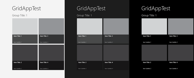
Two of three themes – light and dark - can be selected programmatically by assigning Application.RequestedTheme property:
<Application
    x:Class="GridAppTest.App"
    RequestedTheme="Light"
    ...
High contrast theme automatically activated by Windows once corresponding option is selected in Control Panel.
Predefined themes provide look and feel for standard controls only but if you have some custom controls you can extend themes:
<Application.Resources>
    <ResourceDictionary>
        <ResourceDictionary.ThemeDictionaries>
            <ResourceDictionary x:Key="Default">
                <SolidColorBrush x:Key="TestControlBackground">#FF000000</SolidColorBrush>
            </ResourceDictionary>
            <ResourceDictionary x:Key="Light">
                <SolidColorBrush x:Key="TestControlBackground">#FFDEDEDE</SolidColorBrush>
            </ResourceDictionary>
        </ResourceDictionary.ThemeDictionaries>
        <ResourceDictionary.MergedDictionaries>
            <ResourceDictionary Source="Common/StandardStyles.xaml"/>
        </ResourceDictionary.MergedDictionaries>
    </ResourceDictionary>
</Application.Resources>
Developing my apps, I found that pure themes are rarely used. For example I tend to have dark themed main UI and light input pages. WinRT does not provide mechanism to apply themes to individual pages, so by default such mixed UI will looks similar to the following screenshot:
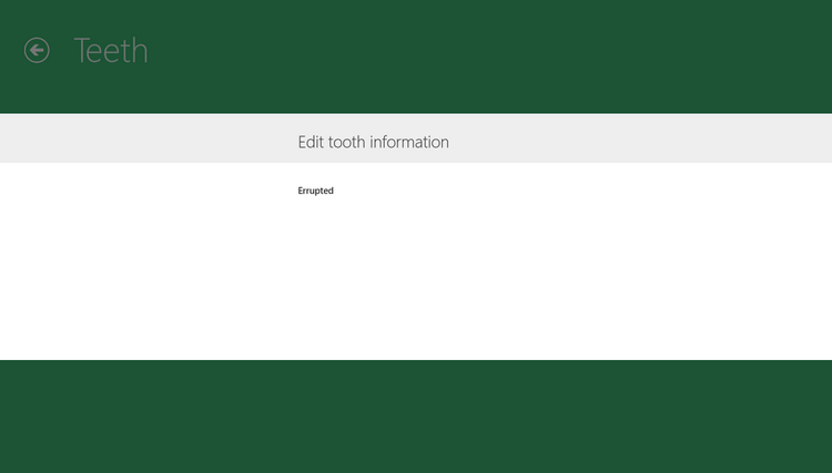
All controls are invisible. Fortunately we work with XAML and there is an obvious solution – to re-style controls. But I am lazy and don’t want to type style name every time I need to add control to UI. Also I always use input controls on a light background so I don’t even need two different styles. In this case a different approach can be used.
Let’s modify buttons to make them visible on white background when dark theme is switched on.
First, open C:\Program Files (x86)\Windows Kits\8.0\Include\winrt\xaml\design\themeresources.xaml
Than copy all SolidColorBrush object definitions associated with buttons
<SolidColorBrush x:Key="ButtonBackgroundThemeBrush" Color="#B3B6B6B6" />
<SolidColorBrush x:Key="ButtonBorderThemeBrush" Color="#33000000" />
<SolidColorBrush x:Key="ButtonDisabledBackgroundThemeBrush" Color="#66CACACA" />
<SolidColorBrush x:Key="ButtonDisabledBorderThemeBrush" Color="#1A000000" />
<SolidColorBrush x:Key="ButtonDisabledForegroundThemeBrush" Color="#66000000" />
<SolidColorBrush x:Key="ButtonForegroundThemeBrush" Color="#FF000000" />
<SolidColorBrush x:Key="ButtonPointerOverBackgroundThemeBrush" Color="#D1CDCDCD" />
<SolidColorBrush x:Key="ButtonPointerOverForegroundThemeBrush" Color="#FF000000" />
<SolidColorBrush x:Key="ButtonPressedBackgroundThemeBrush" Color="#FF000000" />
<SolidColorBrush x:Key="ButtonPressedForegroundThemeBrush" Color="#FFFFFFFF" />
And finally paste all the brushes into your resource dictionary. You can repeat it for other controls to achieve result similar to the following:
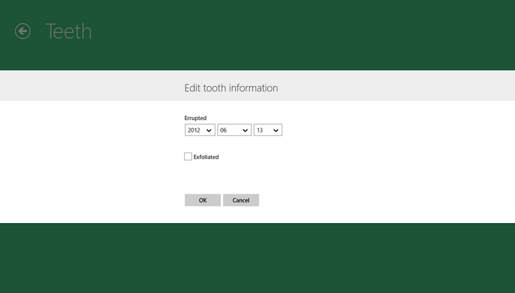
Of cause it will work only if all your controls are used with the same background. Otherwise, you have no other choice but to re-style controls.
blog comments powered by Disqus